 |
| http://a7.sphotos.ak.fbcdn.net/hphotos-ak-ash4/s720x720/422059_241471025933285_105687816178274_575027_992154561_n.jpg |
This 'drive' poster manages to hint towards old 70's American driver films and TV shows while retaining the unique look of the drive posters. It is also an incredibly intricate design with some amazing computer lead artwork and well considered colours. The strange strings in the background resemble a large motorway network which is quite a nice hidden touch.
 |
| http://farm8.staticflickr.com/7165/6793757063_7c3b4670f0_b.jpg |
Some heavy text lead design for a university campus. Not the best work every but I want to start looking at designing some work that is dominated by text. Also despite the designers choosing yellow, red and blue to got together these usually clashing colours are tamed by being slightly saturated. The work also has a nice texture to it which adds to the 70's warn out feel.
 |
| http://29.media.tumblr.com/tumblr_lyo000HdL41r46py4o1_500.jpg |
Using textured backgrounds like this is something I have been doing for my work. I really like the overall design but I'm so weary of using the ribbon myself because it is done so often. Still the colours are very rich and sit well on the page.
 |
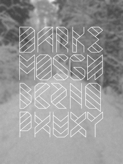
| http://24.media.tumblr.com/tumblr_lynw7ndXH01r46py4o1_500.png |
I would love to find out what this font is called, no luck so far...
The image has a high quality feel but is also quite blurry which would suggest that there is some artificial digital bleed on the lettering. The whole thing looks sort of out of focus and I really like the effect, as well as the dusty texture of the black and the way the letters have been cut into...
 |
| http://25.media.tumblr.com/tumblr_lyo3r3pMQG1r46py4o1_500.jpg |
I find this image fairly interesting, more importantly I would love to learn how to create that watery mirror image. It gives the design some symmetry and places the two animals in a context. without the need to draw a whole stream and with banks etc.
 |
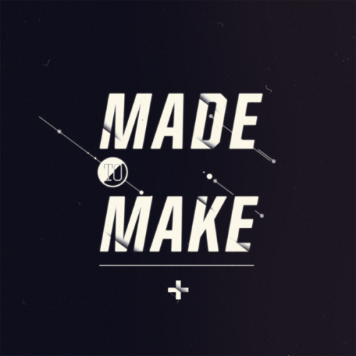
| http://30.media.tumblr.com/tumblr_lyl40lbavB1r46py4o1_500.png |
Some horribly blurred photograph is used to bring the text jumping forward here. I realise that by de-focusing the background, anything that is sharp in the image will jump forward. A good tactic to use if i want to draw the viewers attention to one direct spot.

No comments:
Post a Comment