Panopticism
Institutions and Institutional Power.
-A study into the way we are raised and how it affects our thought and actions.
-How institutions affect our thoughts and actions.
-Social Control
-Berfore the 1600's madmen were tollerate, the village idiot was common but there was no division between the sane or insane. The disabled were often given jobs that they would not be considered for even today.
-After the 1600's a new attitude of work emerged. Anxiety emerged towards the socially useless, those who could not perform tasks as efficiently began to be cast out.
-'Houses of correction' are created for the Diseased, Mad, Criminals and Single Mothers.
-In the houses labour was used as a form of moral reform.
-Im the 18th century the houses of correction were seen as a huge mistake. It was a melting pot of the unwanted which caused massive social problems.
-The houses of correction were broken up into Hospitals, Prisons and Mental Institutions.
-In the Asylums inmates were no longer beaten, they were treated like children; good behaviour was rewarded whilst bad behaviour was punished. They were being re-educated.
-Control switched from physical control to mental control, this lead to the emergence of this form of control on all people in society.
-Social experts emerge in each field, like phycologists, doctors. This sub-validates the new system.
-In this modern form of discipline we take responsibility for our own actions, consequences, punishments and rewards.
-Foucault was interested in this new form of power. "Modern discipline is a technology." aimed to control the conduct and improve the performance of the individual.
-Foucault based his new theories on the Panopticon, a multifunctional building laid out in a circular fashion, with cells around the peripheral wall facing into one control tower. Every Cell could have a full view of the control tower but not of any other cells, giving the impression of always being watched. Each cell had a full open front (with bars) facing the control tower and a small window at the back looking outside.
-Most Panopticons became prisons.
-The design had a fiendish mental effect on the inmates.
-Everything inside is light, visible and on display, the inmates are under constant scrutiny.
-In the panopticon you are constantly reminded of supervision, you never behave independently. You are isolated but never alone, it is a form of phycological torture.
-We are always being watched in the panopticon, once this panoptic effect has taken place the inmate begins to self-regulate. Because the guards may or may not be present at any time but the inmate is unsure they begin to behave automatically. This is an allegory for social control.
-When people believe that they are permanently visible they tow the line.
-For example the open pan office is built, the myth that it is designed to make sure everyone gets along is told as the truth. In reality the knowledge of scrutiny the workers are under makes them work much harder. They are more efficient as a tool.
-The open plan bar is another example. Bouncers and bar staff can see all that is going on, this changes the behaviour of the customers, whereas cosy pubs offer shelter from scrutiny.
-In this respect we live our lives to conform to the wishes of others.
-CCTV
-PC monitoring on networked machines
-Sign in sheets
are examples from college, we turn up even if we dont have to.
-The relationship between Power, Knowledge and the Body. "Power relations are an immediate control of the body." Creating DOCILE BODIES, which are self-monitoring, self-correcting and obedient.
-Power is a relationship: Power is not something that one person has over another, it is a relationship, there has to be a degree of acceptance of the power exercised. For example:
-Facebook
-The Police
-Family
-god
-Mass Culture

Saturday, 27 October 2012
STUDY TASK 2// The Gaze In Advertising. COSMO

For this task I am analysing the front and back cover of Cosmo On Campus, which features two great examples of 'The Gaze' or 'The Look' as Rosalind Coward puts it in her post-feminist essay on the subject.
"In this Culture, the look is largely controlled by men. Privileged in general in this society, men also control the visual media. The film and television industries are dominated by men, as is the advertising industry." pg33.
So firstly and most importantly Cosmo On Campus (Cosmopolitan) is owned by the Hearst Corporation, which controls a massive media empire spanning television, news, magazines, newspapers and several websites. A company run exclusively by men, the only women with any say in the corporation happen to be the grandchildren of William Hearst, as they were left shares in his will. The lead editor of Cosmo on Campus however is a woman, as are most of her peers, so it appears that Cosmo is written almost entirely by women, who cover topics with an editorial style which is controlled by men. As Coward puts it Cosmo is a "Masculine investigation of women", or a masculine idea of how women should look and act. This is an undeniable truth when you see an article labelled 'Look Hot From £1' on the front cover, or the inevitable 'top 10 great sex positions' on the inside.
"The ability to scrutinise is premised on power... Women's inability to return such a critical and agressive look is a sign of subordination" pg33.
In the image of the magazine cover above we see two people meeting our gaze. Firstly, on the front cover is the female. She is smiling at the viewer in full makeup with airbrushed skin, in other words a mans vision of the perfect woman, but more importantly, not a reality. Her pose is important too, she is hiding her hands, a sign of non-agression, it is trusting and permissive, it leaves the whole front of her body unguarded and she stands at ease. She is submissive to the viewer, allowing them to 'Gaze'.
"Those women on the billboards, though; they look back. Those fantasy women stare off the walls with a look of urgent availability."
In contrast, on the back cover, the male character meets your gaze with a much more agressive gaze right back. His skin is probably airbrushed too, but only to accentuate muscle tone, a signal of power and agression. The male character is also covered in tattoos, which furthers the agressive image and where the female hid her hands behind her back the male curls his into fists and displays them prominently, almost raising them for a fight.
So in summary we have a submissive female, portrayed as a male fantasy, weak and innocent. On the reverse a powerful dominant male looking back at you critically.
At this point I began to wonder why a female and a male would be portrayed in this way when the magazine is aimed at women aged 18-25 (students). Both images are a fantasy, based on a masculine doctrine, where the male is a "sort of cross between a rutting stag and David Bailey" and the female is kept as submissive, distant and separate to the male, not because she is particularly aesthetically pleasing but because it it important for the male dominance of society that companies like Hearst rely on to show women in this way. "The aesthetic appeal of women disguises a preference for looking at women's bodies, for keeping women separate, at a distance, and the ability to do this. ...This is a form of voyeurism ... and [voyeurs] are always in control."
So by portraying women as submissive and the male as dominant the female reader feels like she must chase the males fantasy desire to achieve the look that the front cover portrays, or else the rear cover man will judge you. This derogatory image of women, which seems counter to the interest of the magazine actually forces the female to search for the answer to these questions in magazines like Cosmo and Elle (which is also owned by Hearst). So by portraying women as submissive to men in all aspects of the mass media, the corporate machine that Hearst is part of can continue selling products.
Friday, 26 October 2012
Thursday, 25 October 2012
Wednesday, 24 October 2012
DESIGN FOR WEB// Software Workshop 1
ollymoss.com
- Black
- Dull
- Incomplete
- Space
- Empty
malikafavre.com
- Busy
- Gifs
- Bright
- Stop moving
360landstrasse.sf.tv
- Photo
- Streetview
- German
mercertavern.com
- Hipster
- Clean
- Lost type
- Vontage
- Monotone
- Boxes
noble-design.co.uk
- Girly
- Red
caavadesign.com
- CD
- Space
- Circle
Questions for my own site:
What is the purpose of this website?
- To inform
- To entertain
Who is the target audience?
- Gamers
- Historians
- Designers
- Anyone with and interest in Computer Gaming or the history of the technology involved
What do the target audience need?
- Simple layout
- Side-scrolling timeline
- Facts
- Clean colours
- Visual clues hinting at computer gaming
Limitations of Web
Fonts- You have to pay and annual fee for specific fonts, if you run a commercial site. To get around paying, use standard fonts. Specify a font family, use 'if' quotations. 'IF' user doesn't have Helvetica, use Ariel, ect.
You can also use 'WebScript' to install a font onto a website. People can download these fonts so you need a licence.
WWW.fontsquirrel.COM is a website for free web fonts.
Work in RGB only. Work with 'websafe colours' only.
On a retina display iphone the dpi is 227. However if this was transfered to an old screen the screen would be massive.
HTML and CSS can build websites.
HTML stands for Hyper Text Markup Language.
URL - Uniform Resource Locator
CSS- An add-on to HTML, which is limited, Adds in more graphic based websites. Cascading Style Sheets
FTP- File Transfer protocol
CMS- Content Management System
WYSIWYG- What you see is what you get system, like Dreamweaver.
Dimensions: 1024x768 (look in diary for specifics)
Font: Arial, Helvetica, Sans Serif
Alignment: Left
Menu: Home, About, Contact, Work, Play
Background: White
Text: Balck
Sunday, 21 October 2012
DESIGN FOR WEB// The Bad Ones
1. GlitterMaker- Use of bright pink, glitter and gifs.

2. George R.R. 'That' purple colour, purple text and 'that' green. Full of gifs.

3. Sip Hawii. Text too large have to scroll constantly.

4. Yale School Of Art. Background image is a repeat gif.

5. The Worlds Worst website. Set up to be terrible, so that everyone knew what terrible looks like.

6. The Worlds Worst Website Ever. Same as above.

7.Videosonic. Black website, gradients and yellow blocks of text.

8. Ron Oslunds Home Page. Space image, super nova, full gradient and flashing text.

9.ACCEPT JESUS! Background is a fast moving gradient. Text is black.

10. Bieber FanSite, glitter, bad textures and use of pink on pink.

Saturday, 20 October 2012
DESIGN FOR WEB// The Good Ones
1. CREAKTIF - Break and Improve.
A multimedia website where you play as a character. You use arrow keys to run around the world space and hit enter to view the content as you fid it. If this seems like a waste of time t you they include a menu bar at the bottom of the page also, however it is enjoyable to run about if you have some free time.

2. USA Today
Much smoother delivery of news from the industry standard. The new layout run a bit like a social networking site. On top of the clear use of colour and easy to navigate layout the designers implemented new ways to deliver stores to an online audience. The main story text is still all there but they include an interactive image bar which you can flick through before reading the story for some background or extra information.

3. AIGA Competition site
This site runs in the same was as the new Ebay introduction website, with both fixed and moving parts. As you scroll down the circular page shape remains and the images that it frames move. The use of colour is sparse, which really clears up the design for the content to be the most important thing on the page.


4. FA Design
FA Design is a studio design website. It is very simplified with only three main tabs which open up onto a simple list. For example the work page contains a list, this list outlines the studios work and uses a simple tool to indicate how much content is available in each field be merging a bar chart with the menu itself. However I do have a criticism, white text on black is pretty poor.

5. Duex Huit Huit
Still Images dont really do the website any justice and to some degree it would be nicer if the graphics here were better, however from an interactive standpoint this website does do things differently. All of the websites content loads onto one page, a process which is surprisingly quick and efficient. The user then scrolls about the giant page with the arrow keys. The page simulates a sliding motion much like sliding between menu screens on an iphone, so there is a transition but it is quick and the next page fills the whole screen. This gives the website some simple interactivity without loosing too much functionality.


6. Setetres.st
This is a really fun website to view, it is a portfolio website which is fun to play around on but doesn't compromise with function at any point. The opening page is totally free of clutter and immediately sets the tone of professionalism with a hint of comedy. The site works on this very structured grid format and when you hover over a particular icon the grid square it sits in indents and drops, all very stylish.
The portfolio page is neat and condense, when you hover over a bar it expands into the full preview. This is great, however sometimes it can get confusing if you scroll down a page and everything is opening and closing all at once. One of the nicest and most original features is a fake script editing bar, the portfolio is for a web designer so he added this as a joke, but it adds a real personal touch. You can open it and mess about with some settings and even view some ASCII porn.


7. graphicnovel-hybrid4.peugeot.com/
This was an award winning website designed to scroll as a graphic novel. Ignoring the style, which I like but isn't really different, the key to this websites success has been its coding. The novel starts by scrolling down and then continues automatically. A white scrollbar tells you how far through the 'novel' you are. Then out of nowhere the screen is scrolling sideways through the page from left to right then from right to left, then in reverse from bottom to top despite technically still 'scrolling down'. I suppose that here the innovation in coding is the champion.


8. Chrome Web Lab
Chrome web lab is an experiment by google chrome for the Science Museum in London. They are running 7 different experiments aimed as getting people more interested in the possibilites of the internet. The design is solid, with gradients and plenty of white space. The interactivity and coding is amazing and the layout simple buy helpful. The experiments are also a great thing to take part in.


9. Kinetic V5
The website plays out like a graphic novel again, their is a strong theme but once again the magic is in the coding and scripts. The website remains two tone throughout with black and a single other colour. As you scroll though the content is constantly changing and interacting with the next 'page'.


10. UNIVERSERIES
This is a giant interactive info graphic, a database of the American Film industry. The style is modern with a similar feel to the style of my first entry. Darwina also comes to mind. The universe can be expanded to reveal different areas in the industry and read individual bio's of the directors involved. The links you can see are graphical representation of how the directors influenced each other in the films they made.


Wednesday, 17 October 2012
STUDY TASK 1// The Century of Self - Sexy Adverts Part 2
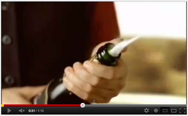
This advert is loaded with sexual imagery. It is basically a fantasy being played out in this woman's mind as she travels to see her boyfriend on a train. The advert is fairly brazen in its usage of this imagery and it doesn't take much to work out whats going on. From a psychoanalytical standpoint the use of phallic symbols like the champagne bottle popping and most importantly the giant red train are the most obvious. At one point the red train even drives straight into a big pink tunnel shaped like a love heart (aka a vagina). There are also some more light hearted sexual tones, lip biting, funny signs, muscly men working in a field. You could also argue that the advert aims to appeal to women who wish to be more independent, as it goes the advert puts women in total control, they are the passengers and the waitresses. The only time men show up they are presented as sex slaves for this dominant woman. Saying this the phallic symbol of the train as it crashes through the countryside displays the masculine power of the train and by association the company itself.
Despite at first appearing to be solely directed at a female audience the advert also works for men. Firstly the female character is good looking, she isn't over-sexualised however she does represent sex. As the character rides the train to Manchester she is clearly fantasising. This is amusing for the viewer but it also associates the Train itself as a 'bringer of sex', the train is literally bringing sex to the male character.
The whole point of Virgin as a company is that sexy things sell well. The company is called Virgin. It sells a rockstar lifestyle. The slogan for this first advert is 'Get to where you want to be. Faster' its a metaphor for self success, a direct nod towards Bernays own philosophy that the masses will buy into a lifestyle even if the basic product is the same. On a more conscious level the advert is trying to say that their trains are faster. In the subconscious levels the advert depicts some sort of weird sex trade, where the female is bought directly to the male for sexual satisfaction, courtesy of Virgin.
The second advert is said to be one of Virgins most successful. Once again there are plenty of obvious visual clues related to phallic symbols and sex. Again the advert sells a hyper-sexy lifestyle, exclusivity and eccentricity. But there are undertones of the Id all over this one too.

 People keep appearing through curtains in this ad. On the left a woman carrying 'ice cream' is walking trough the open blouse of a stewardess who we assume is undressing. Perhaps the curtains are also being used in a similar way to the Silk Cut adverts of the 80's? Perhaps they represent the vagina, or perhaps psychoanalysis has broken my mind.
 Men stroking giant fork handles. Why? Its a tongue in cheek pun, also added in my opinion to add some men in to what could be deemed sexist without them. They act like idiots while the women are continuously sexy and dominating.

 In a super Freudian way this woman bends over and tucks the passenger (i.e you) into bed. She is at once a sexual fantasy and also the mother figure.
 For no conscious reason the 'Erotic Gherkin' building stands alone. In a massive twist of sub-conscious manipulation the advert decides not to include the rest of London allowing the phallic symbol to stand alone, and look much bigger. The building also pulsates with light and at one point emits a beam of light from its tip. It is important to note that the use of this tower is not entirely sexual, the connotation of power is much more important for the company as it is the phallic image of masculine power that they want to portray.
 The final shot arguably contains another phallic image. The massive plane. The shot is basically saying, 'look at how big our planes are'. This isn't sexual this time, merely that the phallic image is a symbol of power. The bigger the phallus the more power, the more desirable for the consumer who wants to achieve a lifestyle of sex, independence and power and can only do so by flying with Virgin.
Despite at first appearing to be solely directed at a female audience the advert also works for men. Firstly the female character is good looking, she isn't over-sexualised however she does represent sex. As the character rides the train to Manchester she is clearly fantasising. This is amusing for the viewer but it also associates the Train itself as a 'bringer of sex', the train is literally bringing sex to the male character.
 |
| Phallic |
 |
| Very Cliché. |
 |
| The train is transporting sex (female character) to the receiver (male character) waiting in manchester. |
The whole point of Virgin as a company is that sexy things sell well. The company is called Virgin. It sells a rockstar lifestyle. The slogan for this first advert is 'Get to where you want to be. Faster' its a metaphor for self success, a direct nod towards Bernays own philosophy that the masses will buy into a lifestyle even if the basic product is the same. On a more conscious level the advert is trying to say that their trains are faster. In the subconscious levels the advert depicts some sort of weird sex trade, where the female is bought directly to the male for sexual satisfaction, courtesy of Virgin.
The second advert is said to be one of Virgins most successful. Once again there are plenty of obvious visual clues related to phallic symbols and sex. Again the advert sells a hyper-sexy lifestyle, exclusivity and eccentricity. But there are undertones of the Id all over this one too.


STUDY TASK 1// Century Of The Self Part 1
TEN TOP POINTS:
1. Bernays Showed Corporations that they could sell products by associating them with their consumers unconscious desires, rather than rational thought and reason.
2. This makes the population happy and therefore docile, allowing the powerful to retain power.
3. Bernays based his corporate strategy on his succes of 'selling the war' (ww1) to the American public, he used the slogan "Make the World a Safer Democracy". When France was liberated the people felt a personal freedom was restored and Bernays wanted to traslate this into the consumer market.
4. Bernays used the female desire for equality to sell cigarette's. By calling them 'Torches Of Freedom' women could use cigarettes to challenge male sexuality. A woman who smokes could be powerful and independent.
5. Irrelevant objects could become powerful emotional symbols of how you wanted to be seen by others. Products could be sold to make the consumer seem more important and individual.
6. Bernays had successfully created an emotional connection between products and people.
7. Before the war products were sold only if they were needed. After Bernays convinced people that they wanted something more than they needed it, that it was natural to 'desire' something. Paul Mazer said that 'mans desire should overpower his needs'.
8. Bernays used psychoanalysis to manipulate basic human desires with public relations exercises:
- Convinced film stars to endorse products, with the view that people would strive to be like them on a basic human level.
- He got celebrities to turn up on the red carpet with his clients clothing on.
- Persuaded organisations to set up fake 'independent studies' to lie about health or beauty benefits of products.
- Associated cars with a dominant male figure and also male sexuality.
9. As society developed it became more important 'to be a consumer than it was to be a citizen'. People became concerned with 'personal freedom' rather than for the good of the majority.
10. After the re-election of Roosevelt, a man who opposed big business control after the stock market crash of 1929, big business fought back by allowing Bernays to convince the populous that Democracy could not work without Free-Market Capitalism. He did this at the New York world fair, painting an image where corporations drove the progress of society and politicians held it back. Consumerism was reborn.
Monday, 1 October 2012
STUDY TASK 1// What is Design for Print?
Branding And Identity
.JPG)
.JPG)
Take Dr Pepper vs Monster. Dr.Pepper relies on its name typed out on the side of the can, monster has worked for a much less time but is much more visually recognisable because of its distinctive monster logo. The colour of the monster can is much more contrasting so really stands out on the shelf. Dr.Pepper, whilst being a classic is really pushed into obscurity. I believe this is because Dr.Pepper is owned by coke, who rely on classic brand identity to sell products and are scared that if they changed the design of Dr.Pepper to bring it up to date they would loose this.
 iTunes gift cards don't have a single apple logo on them because of the massive campaign they ran with this style on TV. As a result customers can instantly recognise iTunes from this image.
.JPG) Morrisons body spay is a rip of deodorant based on Lynx Africa. This is not because of the smell, but because of the colours used on the can, the green black and red is associated with Lynx Africa as a brand as well as certain African cultures themselves.This is the power a well known brand can have over consumer choices.
Morrisons body spay is a rip of deodorant based on Lynx Africa. This is not because of the smell, but because of the colours used on the can, the green black and red is associated with Lynx Africa as a brand as well as certain African cultures themselves.This is the power a well known brand can have over consumer choices.
 G.I Joe's DVD is covered in the red white and blue of the American flag, with a fat, militaristic font on the cover. This alludes to G.I Joe's mission; to bash communism and raise good American children with television.
 An unusual place to find 'print' but this keyboard has been printed with brand identity in mind, as the Alienware gaming computer range has to have a more unique and specialist feel than any regular dell.
Packaging And Promotion.
 This Kindle box has a really smooth varnish effect printed across the front in Black on black. This shows us as consumers that the product is of high quality, the minimalism alludes to high class and sophistication while the box is printed on an uncoated cardboard showing us that the company is environmental conscious and caring.
 Crash records didn't brand their store with any high end graphics studio, however the logo does command some respect in the area, or it used to. The solid black on yellow really puts the bag out of place amongst other shoppers so it is always easy to spot, generating interest in the shop.
.JPG) Games of thrones packaging is a three tiered ordeal, the outer sleeve is most decorative with de-bossing and foiling over the text and illustrations, the inner sleeve is much more basic as it carries the DVD's, so is built to be sturdy. The cover gives the buyer a sense of high quality and a small amount of the mystery of the story in many ways.
Games of thrones packaging is a three tiered ordeal, the outer sleeve is most decorative with de-bossing and foiling over the text and illustrations, the inner sleeve is much more basic as it carries the DVD's, so is built to be sturdy. The cover gives the buyer a sense of high quality and a small amount of the mystery of the story in many ways.
 In exactly the same way as the kindle box this wine box shows the customer that the wine is of high class and sophistication whilst also being responsibly sourced.
 This small local branding and packaging work is all about handmade crafts and clean graphic design. It's for a pop up store and is obviously aimed at the hipster crowd.
 French biscuits packaging, shows a Parisian style. The idea here is to show the customer the kitchen tiles of the bakery the biscuits were made in, this gives the products a more professional, not home made, but individually made, feel.
Publishing and Editorial
 This is the instruction manual which comes with the keyboard (and computer). Its huge and rather unusual shape hints at the size and shape of the computer case itself. The text is embossed into a rubber and card cover and there is a metal emblem on the cover also. This is all designed to show the customer that this machine is a serious gaming computer, not like any other PC around, the feel of the book is heavy duty and large metal screws bind it, its is designed to feel like it is out of a computer game itself
.
 Colours Magazine apocalypse special was printed on recycled paper and card because of the principles expressed in its content which was to use the little resources you can scrounge in the post apocalyptic wasteland. This gave the magazine a very utilitarian feel whilst retaining its attractive cover.
 Designed by Noma Bar the cover of Richard Dawkins 'The God Delusion' works on many levels. It represents an explosive new idea, or a sudden realisation of the truth. The text reigns in the otherwise fairly mental cover and gives the overall design a more scholarly look. http://www.ft.com/cms/s/0/5b0723c6-65ab-11dd-a352-0000779fd18c.html
 Interesting placeholder type cover for a newspaper/ magazine layout, the spaces will be filled in a a later date but it shows the construction without the content.
 Typography book, typography on the front, varnished in woth a light foiling on the header. This all shows off the books good quality and the designers skill, which we assume will be reflected in the content (it is).
 Cheap magazine with cheap content. Short list is a free editorial and the over look/ texture of the cover shows that to the audience straight away. Printed on a nasty newsprint stock and bound with metal staples. This isnt all bad, but is shows the budget the magazine has to operate at.
Information and Wayfinding
 Not exactly the clearest wayfinding, but it is aesthetically good looking, with a simple earthy colour scheme and smooth lines, which is unusual for wayfinding which is usually very sharp and direct.
 Which is exactly what happens here in this London 2012 wayfinding plan. These boards stood like giant obelisks out of the park and gave all sorts of information at different levels. The information higher up would appear in a heavier font, designed to be seen from a distance, while the stuff down at eye level was a smaller font so visitors could walk right up to the sign and look at information in more detail.
 Very simple and modernist park design for a Zoo. The numbers are very subtle illustrations that refrain from being childish, whilst retaining flair, eccentricity and a futuristic vibe (for 1981).
 Stark contrast between heavy black flooring and the super bright yellow. This is more about interior design but the level number is very visible as a result of the colour combination.
 Trainspottingesque wayfinding. The colour combination is rather unusual and the text is very small so I wonder if this was a student project. There are useful pictograms on the poster to identify what sort of amenities are on each floor...
.JPG)
.JPG)
Take Dr Pepper vs Monster. Dr.Pepper relies on its name typed out on the side of the can, monster has worked for a much less time but is much more visually recognisable because of its distinctive monster logo. The colour of the monster can is much more contrasting so really stands out on the shelf. Dr.Pepper, whilst being a classic is really pushed into obscurity. I believe this is because Dr.Pepper is owned by coke, who rely on classic brand identity to sell products and are scared that if they changed the design of Dr.Pepper to bring it up to date they would loose this.

.JPG)


Packaging And Promotion.


.JPG)


Publishing and Editorial

.


Information and Wayfinding


Subscribe to:
Comments (Atom)