Saturday, 11 February 2012
Wednesday, 8 February 2012
OUDG 405 Self Evaluation
|
1. What skills have you developed through this
module and how effectively do you think you have applied them?
|
|||||
|
I have an increased knowledge
of Photoshop and illustrator, which I used for all of the design briefs in
this module. I have also applied some of the techniques and theory’s we have
been taught in other modules to this one, for example which layout is correct
as well as some colour theory and the correct use of type.
In most cases I have applied
the skills I have learnt as best I can. In some mock up pieces I used tools
in illustrator for example to get work done very quickly and when I went to finish
I worked into the designs until they were much more desirable. This is
evident in the posters for the 100 things brief, were the posters all started
looking very messy and gradually progressed.
|
|||||
|
2. What approaches to/methods
of design production have you developed and how have they informed your
design development process?
|
|||||
|
In this module, especially on
the 100 things brief I carried out huge amount of research that meant that
when I went to design the work I full understood what I was saying. I found
that I could write body copy on the subject fluently and did not need to
double check facts online. I felt that I fully understood the topic, although
it is not black and white and there is no conclusion.
I also developed more on the system of designing in illustrator. For the products I made were mostly text based with vector graphics images. The How To brief really tested my ability to produce work quickly and work as a team which is a skill I definitely think I have improved on since the start of the year even. |
|||||
|
3. What strengths can you
identify in your work and how have/will you capitalise on these?
|
|||||
|
I think I have become less
afraid to produce more experimental work and not follow a pre-existing style
as closely as I used to. In the future I would love to break free from
conventional design for a module, although saying that I love design that
follows the rules too.
I also think I have worked out
some good colour theory, in most products I would like to think that the
colours are all suitable for each other and none of them clash. This is a
skill I could develop further however, I feel that although I know what
colours wont go together, I don’t yet fully understand which colours do.
|
|||||
|
4. What weaknesses can you
identify in your work and how will you address these in the future?
|
|||||
|
Weaknesses I have is that I
feel slightly like I have become obsessed with illustrator and have become
tied to its limitations. For the next module I would like to leave
Illustrator for some experimental work in a different medium.
I also think I made some
design errors on one of two of my designs, for example the Dark side to
Diamonds poster, which has a terrible drop-shadow effect on it. There is a
message here that the effects in illustrator are to be avoided at all costs.
I also started using high
resolution images in illustrator, which was a huge mistake because it crashed
the program on Macs, even my Pc struggled a bit. In the future I need to edit
the images in photoshop and rasterise them until they are a low enough
resolution that they will not crash illustrator.
|
|||||
|
5. Identify five things that
you will do differently next time and what do you expect to gain from doing
these?
1)
Create some design
sheets and sketch more designs, I except that this will allow me to explore
more ideas. In a way at the moment, I experiment in illustrator, but of
course the limitations here are huge.
2)
I need to document the
design process more clearly, at the moment I tend to design things in
illustrator and neglect any form of documentation because I feel that if I
stop designing I will fall off the horse. I expect this will allow me to get
better grades.
3)
I should listen to good
criticism early on and change my designs. I Did change my designs because of
suggestions this time but after I printed
and ran out of other opportunities to print people still pointed
things out to me they would like changed, in the future I should print things
cheaply and ask for help during the designing instead of after the final
prints. This would obviously allow me to change my designs while I still have
a chance.
4)
I should manage my time
better. In this project I found that although the designs were all spaced out
I did somehow end up blogging at about midnight or in the early hours of the
morning. This is because dinner, washing, socialising with the people I live
with can fill a gap between getting home and working on projects. I desperately
need to find a good balance and stop cooking meals that dig into work time I
guess. This should give me more time to document the days work and generally
be a better designer.
5)
I need to learn how to
prepare designs for print better. I went several times to print out stuff for
this module and although most of the settings were ok, because I had lots of
double sided, things got a bit confusing and the alignment was rarely
correct. There are lots of reasons for this, mainly my set up, then I found out
that paper from the library is cut to the wrong dimensions. In the future I
could go and talk to James about prints and then go and buy the paper and set
up the files. This would allow the print process to go smoother and take up
less time.
|
|||||
|
|
|||||
|
6.How would you grade yourself
on the following areas:
(please indicate using an
‘x’)
5= excellent, 4 = very good, 3
= good, 2 = average, 1 = poor
|
|||||
|
|
1
|
2
|
3
|
4
|
5
|
|
Attendance
|
|
|
|
|
x
|
|
Punctuality
|
|
|
|
|
x
|
|
Motivation
|
|
|
|
x
|
|
|
Commitment
|
|
|
x
|
|
|
|
Quantity of work produced
|
|
|
x
|
|
|
|
Quality of work produced
|
|
|
x
|
|
|
|
Contribution to the group
|
|
|
|
x
|
|
Monday, 30 January 2012
100 Things// More Inspiration
 |
| http://a7.sphotos.ak.fbcdn.net/hphotos-ak-ash4/s720x720/422059_241471025933285_105687816178274_575027_992154561_n.jpg |
 |
| http://farm8.staticflickr.com/7165/6793757063_7c3b4670f0_b.jpg |
 |
| http://29.media.tumblr.com/tumblr_lyo000HdL41r46py4o1_500.jpg |
 |
| http://24.media.tumblr.com/tumblr_lynw7ndXH01r46py4o1_500.png |
The image has a high quality feel but is also quite blurry which would suggest that there is some artificial digital bleed on the lettering. The whole thing looks sort of out of focus and I really like the effect, as well as the dusty texture of the black and the way the letters have been cut into...
 |
| http://25.media.tumblr.com/tumblr_lyo3r3pMQG1r46py4o1_500.jpg |
 |
| http://30.media.tumblr.com/tumblr_lyl40lbavB1r46py4o1_500.png |
Saturday, 28 January 2012
Sunday, 22 January 2012
100 Things// Inspiration
These are some designs I have been looking at for inspiration on this 8 week brief. I realised that most of these posters that caught my eye have some very central circular figure that I could transfer into the shape of a diamond for my work...
This is just an ad for a designer, I like the mystical nature of this work. All different components floating above a desert at an artificial nighttime. It is a strange decision to make the only object with colour the triangle. This is something I could consider for the postcard brief too.
This is a smart poster about the holocaust. It is essentially a timeline of 'antisemitism' and the large zone in the middle marks the dates of the holocaust, also creating the moustache of Hitler who is fairly hidden in the background. There is something about this poster that I find quite cheesy. Knowing that this is such a serious subject, the designer seems to have ignored that drawing fake moustaches on pictures of people is comical, and im not sure if this adds to the work of takes away something from it.
Again some surreal design, another landscape. Not sure if this actually falls into fine art...
But the shape in the middle with its symmetry is something I can take inspiration from on this current brief. Creating something similar and replacing it with a diamond is something I could test out. I like the darkness of this work, its quite mysterious and has some real character for me.
Another strange space themed design for Nova 9, a pinball game that I assume is based on the sci-fi tank game from 1991. Still the level of Photoshop skills here is pretty inspirational and it continues with the surreal space like theme of some other work I have been looking at. I cant work out if the image is of a ball hitting a surface and shattering something of if it is an image of a planet being ripped apart.
The same thing again. Black and white landscape which some bizarre central object. I didn't realise when I was picking these designs that I was so drawn to this layout. Its is probably something I should consider when I design some more Posters and Flyers of 100 Things.
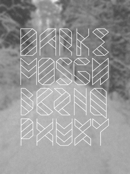
Carton is one of many new fonts I have downloaded for this brief, I showcase this one because it is probably the nicest and well rounded out of the lot. It has a quite relaxed but heavy feel to it because it has serif's but is all uppercase as the same time.
 |
| http://29.media.tumblr.com/tumblr_lyk82piGa31r46py4o1_500.jpg |
 |
| http://behance.vo.llnwd.net/profiles2/105815/projects/2990177/058cc131e700a244fbc4b370f8915038.jpg |
 |
| http://farm8.staticflickr.com/7017/6774821985_05b4328ddd_b.jpg |
But the shape in the middle with its symmetry is something I can take inspiration from on this current brief. Creating something similar and replacing it with a diamond is something I could test out. I like the darkness of this work, its quite mysterious and has some real character for me.
 |
| http://tutorialstorage.com/wp-content/uploads/2012/01/b2e2e252be98b5a597219ae4763d73d0.jpg |
 |
| http://tutorialstorage.com/wp-content/uploads/2012/01/take_me_by_kevinarya-d4mk7je.jpg |
 |
| http://imgs.abduzeedo.com/files/ffff/137/carton.jpg |
Thursday, 19 January 2012
100 Things// Poster Inspiration!
Here are some posters I have been looking at as inspiration for the set of 10 print based ideas I will come up with over the next few days...
 | |
| http://behance.vo.llnwd.net/profiles/54431/projects/690930/d3c2fb52a80d92485c723a13bc27b38e.jpg |
 |
| http://behance.vo.llnwd.net/profiles/54431/projects/690930/09cedcf836d05891042052806511537e.jpg |
 |
| http://behance.vo.llnwd.net/profiles/54431/projects/690930/635a1b5fbee21b93ef05eeebf16ee741.jpg |
 |
| http://behance.vo.llnwd.net/profiles/54431/projects/690930/e0e2225b66180d0e53811543695dd255.jpg |
 |
| http://behance.vo.llnwd.net/profiles/70755/projects/210037/707551239634659.jpg |
 |
| http://behance.vo.llnwd.net/profiles/59471/projects/352978/594711258923662.jpg |
 |
| http://behance.vo.llnwd.net/profiles/87603/projects/311165/876031254352048.jpg |
 |
| http://behance.vo.llnwd.net/profiles/73320/projects/114292/733201217945991.jpg |
Subscribe to:
Posts (Atom)


