
For my current brief I have been looking at work by the
Anglo-Scandinavian design team Non-Format, which creates what I
understand to be very post-modern fractured style. I have included a few
scans from one of their books 'Love Song' which I took particular
interest in while designing the name-card for Eve. I wanted to use this
fractured style because I thought it may complement a fractured
typeface.


These pages make the use of type to effect the tonal values of the images they overlay. Its a very post-modern style so it by nature, completely pointless. Buts aesthetically is is interesting and if I adopt this style I could show off aspects of my typeface over image for the name badge.

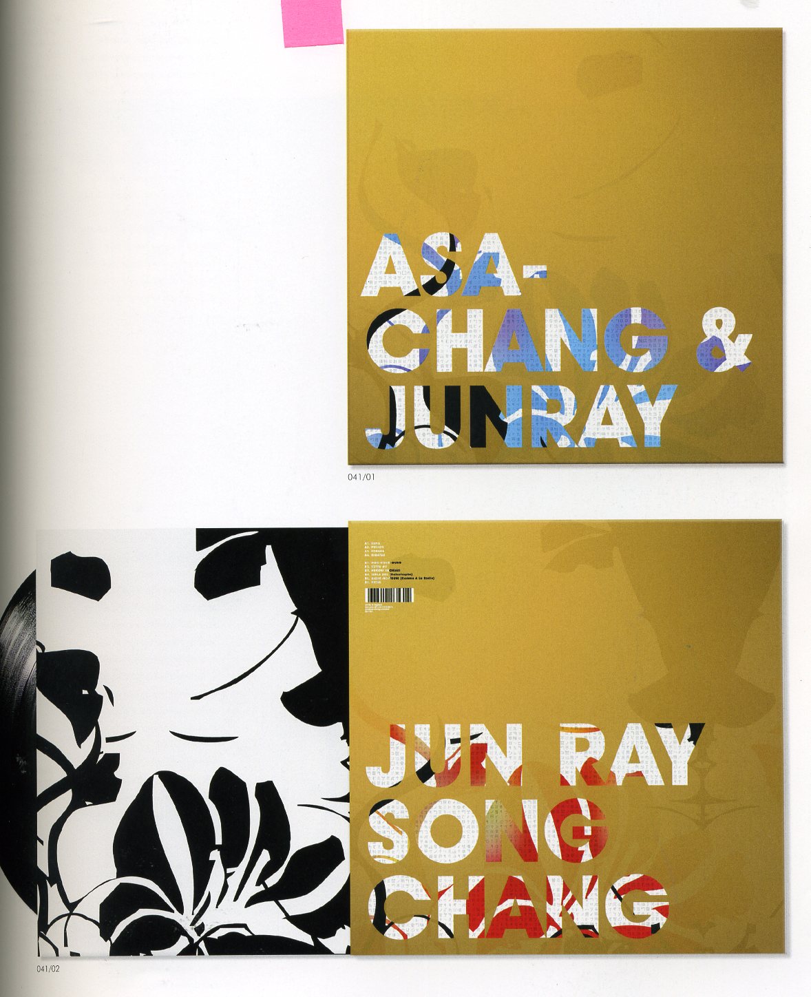
I think I like Non-Formats styles because of collaboration between Modernist and Post-Modern styles. Use of clean, solid fonts for text and then filling the surrounding space with over the top decoration, images and solid blocks of colour all of it unnecessary but aesthetically pleasing.

Interesting use of a formula to create a unique typeface. The designer has set specific rules to follow to create this work. Vertical lines and a grid system confines the type to a set of rules, I should incorporate this into my own work. It allows for uniformity an structure. however at the same time I need to consider if this is what I want to say about Eve.

Heavy use of lighting effects and drop shadows that I could incorporate into my name badge design. I also really like the folded 3d style of the 'TRY'. It adds dimension to the work, all of these images allow the type have some motion on the screen. I also like the Stanley Kubrick reference.

These colour wheels highlight the main differences between RGB and CYMK. This is presented in a simple and interesting way by using white and black backgrounds. The colours create the typical heart shape from this well known and overused saying but add a unique touch to it.
No comments:
Post a Comment