 |
| Enterprise |
 |
| SKYLON |
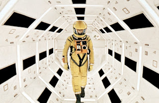
As part of my What is Good? Module I have been looking at a few space related pieced of fiction and non-fiction, what I have enjoyed about my research has been that the two are becoming closer and closer. For example the SKYLON is the closest thing we have at the moment to the USS Enterprise, in that it could theoretically take off fly about in space and return to earth in just one single stage. The Sylon will be capable of about mach5 or 3,800mph in earth atmosphere and its this sort of amazing information that I want the UKSA visual identity stuff to be identified with, as Nasa is with the space shuttle. I have also been looking at other space related fiction like the Kubrick film 2001, which was utterly visionary for the time and still pulls of a sense of distant future even today, way after the real 2001. I would love to take the visual clues that are liked to space and use them im my own designs, this is what made it clear to me that the UKSA logo needed to be circular and white and blue. These seem to be visual identifiers of space, any film shot about space or the future will use a lot of blue lighting and its this that I want to transfer into the graphic design element of this project.


No comments:
Post a Comment