This is a 50's retro design for a record sleeve. Today this sort of design is fairly popular in a post-modern context so it would be acceptable to produce something distinctly post-modern for the branding. At the same time this doesn't really work for logos as it does for other products as clarity is key.
Pip-Boy is part of the universe created by Bethseda for their massive game Fallout 3. He is an animated character who appears on your menu screens as a sort of AI helper. The tone here is post-nuclear wasteland however a 50's inspired character like this would be an interesting thing to develop for a drinks brand.
This is another screen shot from Fallout 3 showing the sort of device that PipBoy appears on.
TGI Fridays uses 50's Americana style branding and its doing terribly. Although the 50's is still popular to niche markets, like in design and high fashion, its not doing so well in mass culture.
Generic imagery of what Soda bars look like. The aim of the bars was to provide a place for young adults to go drinking at night in the US when they still couldn't drink alcohol. The theme is very much coca cola red, black and 50's drag racing inspired.
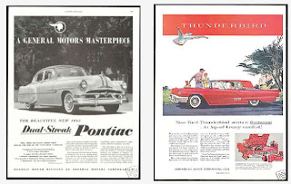
Ads I do like from the 50s are always of big American cars these were products that were sold to the masses for the first time in really great numbers in the 50s to the development in terms of advertising was rapid.
Examples of posters I do not like from the 50's, things to avoid.


No comments:
Post a Comment