Sunday 29 April 2012

5 Visual Communication Designers

1. Shepard Fairey.

Shepard Fairey is a street artist inspired graphic designer and artist. He creates illustrations for popular culture and mass consumption.   

http://obeygiant.com/
http://en.wikipedia.org/wiki/Shepard_Fairey
http://vimeo.com/5148749


2. Jason Munn


Illustrator and designer best known or his album covers and posters. Works with pastel colours and simple but intelligent design, often with hidden meaning and metaphor.


http://jasonmunn.com/posters.php
http://postercabaret.com/gallery/jason-munn.html
http://grainedit.com/2007/11/01/jason-munn-interview/

http://en.wikipedia.org/wiki/Jason_Munn


 3. Komboh


An illustration and design team. Work with type and text in a wide range of ways.


http://komboh.com/
http://www.formfiftyfive.com/2012/05/komboh-2/
http://graphicoptimism.com/2012/05/komboh/


4. Magomed Dovjenko

Very young illustrator who works for a wide variety of clients as well as being part of the Keystone Design Union.

http://iammago.com/
http://www.formfiftyfive.com/2011/08/interview-magomed-dovjenko/
http://thekdu.net/


 5. Ed J Brown


Freelance illustrator, uses pastel tones and child-like illustration for a selection of clients. 


http://www.formfiftyfive.com/2012/05/ed-j-brown/
http://www.edjbrown.com/


Saturday 28 April 2012

5 Advertising Designers

1. George Lewis

Designer/ creative director for Esquire magazine at a time when it became world renowned for brilliance in journalism. Mostly worked with portraiture here but also designed ad campaigns for many many other organisations. Became a 60's design icon.

http://www.georgelois.com/index.html
http://en.wikipedia.org/wiki/George_Lois
http://www.vice.com/read/george-lois-671-v18n1
http://www.aiga.org/medalist-georgelois/


 2. Raymond Lowey

Another design icon like Lewis. Creative director and designer for some of the biggest brands of all time, working mainly for large corporations and the US government. He also designer massive locomotives and chairs.

http://www.raymondloewy.org/
http://en.wikipedia.org/wiki/Raymond_Loewy
http://www.raymondloewy.com/
http://www.designboom.com/portrait/loewy.html


3. Sir John Hegarty/ BBH Global

Multinational ad agency. Known for having good ideas as well as controversial ones, most recently; using homeless people as wifi hotspots. They cover all aspects of advertising from film to design.

http://www.bartleboglehegarty.com/#!/global
http://www.nydailynews.com/blogs/dailypolitics/2012/03/public-advocate-bill-de-blasio-to-bbh-global-keep-your-homeless-hotspot-stunt-
http://en.wikipedia.org/wiki/Bartle_Bogle_Hegarty


4. Snask


Design and Ad agency based in Stockholm. Known for being slightly insane and then producing sleek corporate design.

http://snask.com/eye-candy/
http://vimeo.com/10435821
http://www.40fakes.com/studio-visit-snask/


5. Milton Glaser

Most famous for I love NY, branding and starting the new york magazine. One of the very few 'famous' graphic designers.

http://www.miltonglaser.com/
http://en.wikipedia.org/wiki/Milton_Glaser
http://www.designboom.com/eng/interview/glaser.html
http://www.youtube.com/watch?v=b0VPVbFY4Kg

THEORY INTO PRACTICE// Cover

 I wanted to design a cover that really stood out. One that looked a bit strange, but also conveyed the content of the publication immediately. I decided that I would create a clear modernist cover and then smack a post-modern design on top. The two would interact with each other, both being clear. 
 I started with this font called 'Friday 13th' that I found on Dafont recently. I just downloaded it on a whim but it has really become useful to me. It adds a messed up rough side to the cover.

The 'modernist' side of the cover is in bebas and covers the scrawled text so that each is visually equal. Although I do think that the heavy black text dominates the page, the bright magenta stripes allow focus on the smaller white text also. I also added the tag line 'puzzles 'n' shit' which in retrospect was a bad move. I guess I was tired while I made this.

Just messed around with the text to explore the dynamics between the different layers.

I settled for this version, which is more similar to the earlier one. I did change the tag line to ' we got puzzles', again, looking back this may have been stupid. Then again it adds some post-modern flare.

Sunday 22 April 2012

5 Media Specificity Designers

1. Alex Tew

Programmer who decided to sell space on his homepage by pixel. As a result he creates the million dollar homepage. This could only be a product of the internet.

http://www.milliondollarhomepage.com/


2. JESS3

Designed a series of good looking QR code, usually fairly ugly. They work and wouldnt exist without the technology.

http://jess3.com/qr-code-art/
http://www.digitalbuzzblog.com/infographic-qr-code-art-by-jess3/


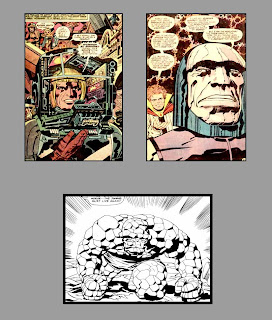
3.Jack Kirby

Very famous American cartoonist responsible for the Avengers. Also created well known American comic strip style.

http://www.pigdogproductions.com/jack%20kirby.html
http://kirbymuseum.org/


4. Maurice Binder

Title sequence designer, worked on Dr.NO and is credited as being one of the pioneer of the gun barrel sequence of all James Bond films.

http://en.wikipedia.org/wiki/Maurice_Binder
http://www.imdb.com/name/nm0082800/
http://www.salon.com/2002/07/29/bond_titles/


5. Rockstar Games

Rockstar games employ in house graphic designers to create their own branding, advertisement and in game content. This really shows through in the quality of their games.

http://en.wikipedia.org/wiki/Rockstar_Games
http://www.rockstargames.com/